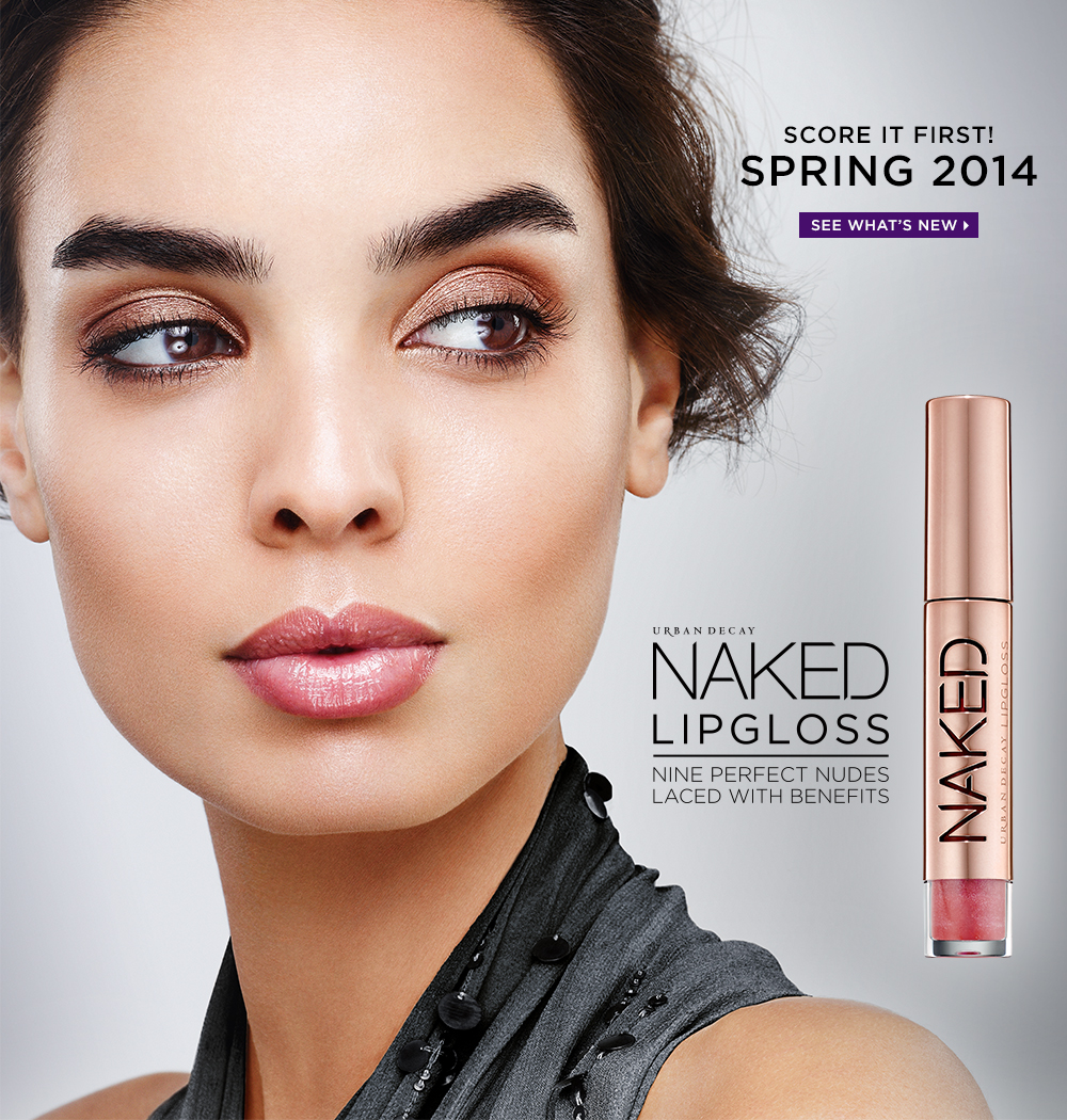
Tuesday 6 May 2014

Project Evaluation and Final Images

FINAL IMAGES


Natural Beauty 

 Smokey Eye
 
 
Strong Lip

Eyeliner/Brows/Lashes

Metallic/Pearlised
 

EVALUATION

Overall, this project was harder than I initially expected. This is because I found it hard to design a shoot inspired by a like UD which has such strong themes, without copying shoots the brand had done in the past. Urban Decay,had its pros and cons in that it uses a lot of colour as well as more natural ones that I could incorporate into my natural face shoots, this is a pro. A con was, for example, there is so much metallic in the brand that it was hard to differentiate between the actual metallic shoot and the others. I had to be creative and think on my feet once I saw that this was happening on camera. 
Because this is a beauty unit, I really had to make sure that the makeup was technically good as I couldn't rely on crazy colours and shapes to hide any flaws like I might do on a fashion or conceptual shoot, and i can tell already that that has greatly changed and improved my technical skills and eye for detail. The project forced me to become better at base application especially. 
I had a lot of ups and downs with this project - I was let down with photographers and models were often late once I'd managed to find them. However, this allowed me to put my problem solving skills into use to overcome the problems. Having to jump in and do my own photography, which I was so bad at before the project started, allowed me to improve my photography skills on the spot to the point where I am now relatively confident behind the camera.
The project and the research that I did surrounding the project really helped me understand the industry and how important it is to have a strong brand. It has helped me get an idea of what I need to do to brand and market myself through my career.
There are a few things that I could have done better - Although I did  lot of planning for my lip look I still think ideally I would've liked to have done a re-shoot because the shape of my models lips were harder to work with than i first thought. I also had some trouble getting my metallic look to show up on camera and found a lot of the metallic element was lost so if I were to re-shoot I would've done more research around capturing metallics in photographs. I had a few issues with hair because the brand isn't overly adventurous with its hair, and i find it harder to do plain hair looks rather that styles.
I was happy with my styling and think that overall I have captured the essence of Urban Decay. I feel the backgrounds that I photoshopped in really tied everything together, and I'm happy with the technical side of them makeup, there was very little that I had to photoshop - just a few blemishes and camera-tone correcting.

.

.

Illamasqua Timed Assesment Design

 Concept

My concept has two aspects that have lead to my final design ideas. I wanted to build my main concept around the future of makeup, but also wanted to build the design around two Illamasqua products in particular. The products I chose to base the look around were Precision Ink in Scribe – a white liquid liner, and Sealing Gel – a clear liquid that turns any powder into a  waterproof liquid.

I used these products to create a concept that is inspired by the Ilamasqua brand DNA. Although being alternative, bright and extreme, I've noticed that Illmasaqua uses a lot of shape and lines in their makeup and this is really what I wanted to come through in my work. I thought scribe would be good to create some strong lines, and I also thought white would be a good colour to use as eyeliner, as usually we would use black. It would be in the Illamasqua identity to mix things up in this way.

A huge makeup trend at the moment is winged liner. My vision of the illamasqua identity for the future is that we will continue to have these trends that are common now, but we will enhance them, make them more extreme, colourful and layered. To do this I used the Illamasqua precision ink in scribe to create a strong, exaggerated eye line and built up layers of Apex with sealing gel to create a bright orange/red liquid line above this. Black lines seal everything together for more drama and impact.

I think makeup will be tonal with people matching tones of their eyes, lips and blusher and this is what I tried to do using the same products on the lips as the eyes, and toning some in through the contour colour. 

I wanted to play on the “bushy brow” trend by really exaggerating it and again, playing with shape and line.

The hair is also a trend cross-over. We are constantly switching between wanting perfectly neat or messy, textured hair styles. So why not have both these elements in one style? My hair styles starts off neat, strait and structured and flares out at ear level to create texture, volume and frizz.


Face Design

  Makeup is tonal, extreme and all about line and shape. Lips are defined. Liner is extreme and shaped. Brows are bushy and exaggerated with powder. Contouring between the eyes, under cheekbones and above the cupids bow contribute to face shape and depth.


Eye Chart shows direction of lines and shapes between liners gold shadow below the eye and messy brows.Eldora D154 lashes to give fluttery-winged effect and the subtle gold glitter on them tones in with the makeup and gold undertones under the eyes


Hair Chart:  

Hair will be smoothed out and strait on top, and neatened using a toothbrush and hairspray. Then it will flare out by the ears in a crimped, separated frizzy style.


PRODUCT LIST - FACE
 
Screenface Crème Foundation Palette
Illamasqua Powder Eyeshadow in Apex
Illamasqua Sealing Gel
Illamasqua Precision Ink in Scribe
Illamasqua Gleam Highlighter in Aurora
Illamasqua Bronzing Duo
Illamasqua Reflection Palette
Eldora False Eyelashes D154
PRODUCT LIST - HAIR
Small plated crimpers 
Hair Extension brush
 Tail Comb 
Hairspray 
Toothbrush (for stay hairs)


Photo Backgrounds

After shooting my photos i noticed that, although I was happy with the outcome there was something missing from them. There is something about Urban Decay shoots that lets you know that it is Urban Decay strait away and it was something that wasn't just in the makeup or hair. After analysing some iconic UD images I noticed what this was - all UD photos have  jazzy background! Usually flowers or a pattern or a nice interior - they very rarely have  plain background like my photos. So I decided to include this and photo shop my photos onto  a jazzy background to give it more of a UD flavour.

I decided eventually to go with flowers because they gave a good girly contrast to the edgy makeup, which matches UD's "beauty with an edge" mantra perfectly. I chose a different background for each look to compliment it. I got the images from a royalty free wallpaper downloading site, flashrolls.com.

MOODBOARD OF BACKGROUNDS


Above is a moodboard of the sort of backgrounds that I'm thinking of using and the type of thing that I think will go well with the UD look. I want them to be busy, girly and colourful because that's what UD is all about. They will add a lot more interest and colour to the look and it is the sort of concept that can easily be used by a UD campaign in reality.

Urban Decay Models and Choosing My Models

I want to use models in my Urban Decay designs that are similar to the brand. A t a glance, I can see that Urban Decay always use similar models in their campaigns. They are typically:
  • White females
  • Strong jaws
  • High cheekbones
  • Thick brows
They have used models of different races but only, so far, for the NAKED skin range. 


Because Urban Decay models have a very distinct look I am going to try and find models that have the same look about them. 

MODELS I'M CONSIDERING

I really want good models because I've learnt before that the right model can make the photograph and a bad model can have an effect on the outcome. Carly is a friend that I've used before so I know shes a good model and able to take direction from me.


This is Carly, and when compared to the Urban Decay Models she shares a lot of similarities - thick brows, high cheekbones and a strong jaw. Her hair will also be good to work with as the majority of Urban Decay Models have long hair (and Brunette seems to be favoured by the brand.) I would like to use her for the majority of my shoots but I think it'll be nice to have some diversity in there so I will continue my model search for the rest of the shoots.

Hair Tests

From researching the hairstyles that are used within the Urban Decay photoshoots and campaigns I can see that hair isnt a huge part of their styling - there is a definate focus on makeup and hair seems to be styled to look nice and compliment the makeup, rather than for any specific concept. (See UD hair research post)

I like the plaiting that tey use because its a bit more intricate and will allow me to show what I can do more than the other styles that UD use (typically down and waved) so I did some tests to see how to go about. I wanted a braid headband.

TEST ONE


I was not happy with my first attempt. The braids didnt make enough of an impact from the front and looked a bit lack-lustre. There was also an awkward crossover at the front that I wanted to get rid of.


TEST TWO

I tried the same look but used a one-sided french plait across the head to give the illusion of a plait headband, and while I liked the overall look and it was a lot neater, it still didnt give enough emphasis from the front and I really wanted it to appear on camera.


TEST THREE

I reviewed my models hair to see how I can make the most of it in this style and its so long and thick that this really helped me think of a new way of creating this style. I used the whole hair from the back of her head to make the plaits extra thick - this wont matter from the back as the photos will be taken from the front - and brought them round to the front. They looked a lot more enhanced and clipped nicely. I tried the look up and down, and I love it more down so my plan is to take to thick sections out from the sides and curl them using rollers.